Creating a premium yet approachable online presence for a ceramics studio centered around craft, community, and creative discovery.
Year
2025
Services
Brand Strategy
Website Design
WordPress Development
Copywriting
E-Commerce
UX Strategy
Client
Clay + Coast Studio
Objectives
Workshop Participation
Community Engagement
Brand Positioning
Project Overview
Clay + Coast is a coastal-inspired ceramics studio built around the idea that creativity should feel approachable, grounding, and deeply human. Through beginner-friendly and multi-week pottery workshops, the studio encourages people to slow down, disconnect from the noise of everyday life, and reconnect with the creative process through clay. While the business includes a small retail component, the heart of Clay + Coast has always been the experience itself — creating space for people to learn, experiment, and engage with a slower, more intentional form of creativity.
Punch Digital was brought on to develop the complete brand and website experience. From branding and copywriting to website design, development, and user experience strategy, the goal was to create a digital presence that felt like a natural extension of the studio itself. Every decision was guided by the same principles that shape the Clay + Coast experience: simplicity, craftsmanship, intentionality, and connection.
The Challenge
One of the biggest challenges facing the project was balancing premium branding with accessibility. Many creative brands unintentionally position themselves in a way that feels exclusive or intimidating, particularly to beginners. Clay + Coast needed to feel refined and thoughtfully curated while remaining welcoming to someone who had never touched a pottery wheel before.
The website also needed to support the business’s primary objective: workshop participation. While e-commerce functionality was important, selling products online was never intended to be the focus. The challenge was creating a site that encouraged visitors to engage with the experience first, while still providing a space for the shop to exist naturally within the overall ecosystem. At the same time, we wanted to avoid the common pitfalls of modern web design — excessive animations, cluttered layouts, oversized marketing sections, and generic filler content that often distract from the message rather than strengthen it.
Pantone® 6189 C
C86 M53 Y65 K50
#223f3c
Pantone® 4246 C
C17 M20 Y31 K0
#d2c5b1
Pantone® 9183 C
C7 M12 Y23 K0
#e7dac4
Pantone® 9285 C
C1 M5 Y8 K0
#f8f0e7
Headlines:
Cormorant Garamond
A B C D E F G H I J K L M N O P Q R S T U V W X Y Za b c d e f g h i j k l m n o p q r s t u v w x y z0 1 2 3 4 5 6 7 8 9. , : ; ! ? ' " ( ) [ ] { } < > / \ | - _ + = * & ^ % $ # @ ~
Paragraphs:
Work Sans
Lorem ipsum dolor sit amet, consectetur adipiscing elit. Pellentesque eget leo eu arcu sagittis vestibulum. Aenean ultricies lacinia sapien nec aliquam. Nam at augue non libero accumsan vulputate. Lorem ipsum dolor sit amet, consectetur adipiscing elit. Suspendisse velit nisi, dictum vitae felis eget, sodales venenatis magna. Morbi non tortor vitae tortor convallis ullamcorper. Etiam ultricies, nunc eu tempor rutrum, nulla arcu facilisis tellus, eu vulputate arcu erat ac massa.
The Solution
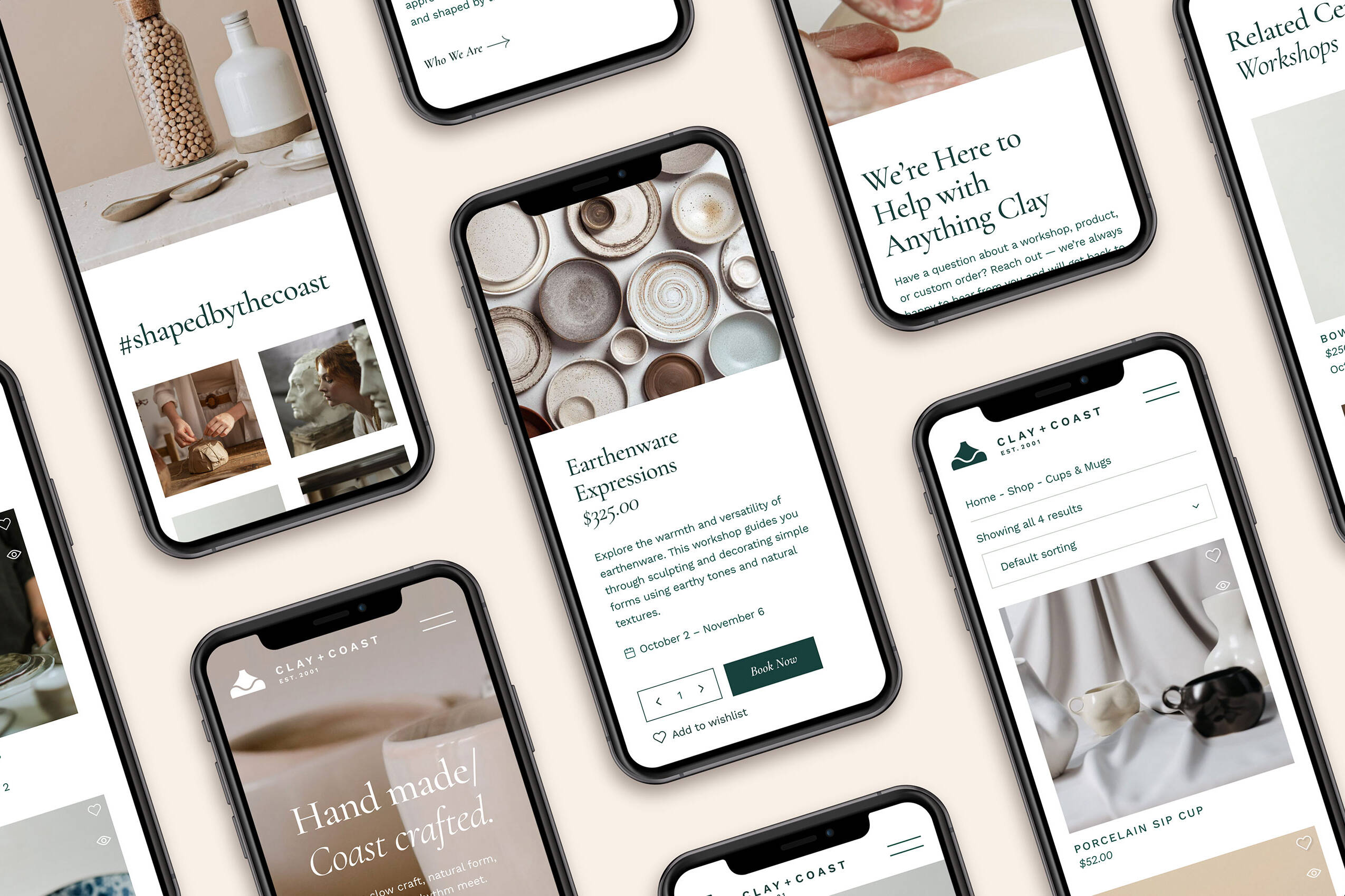
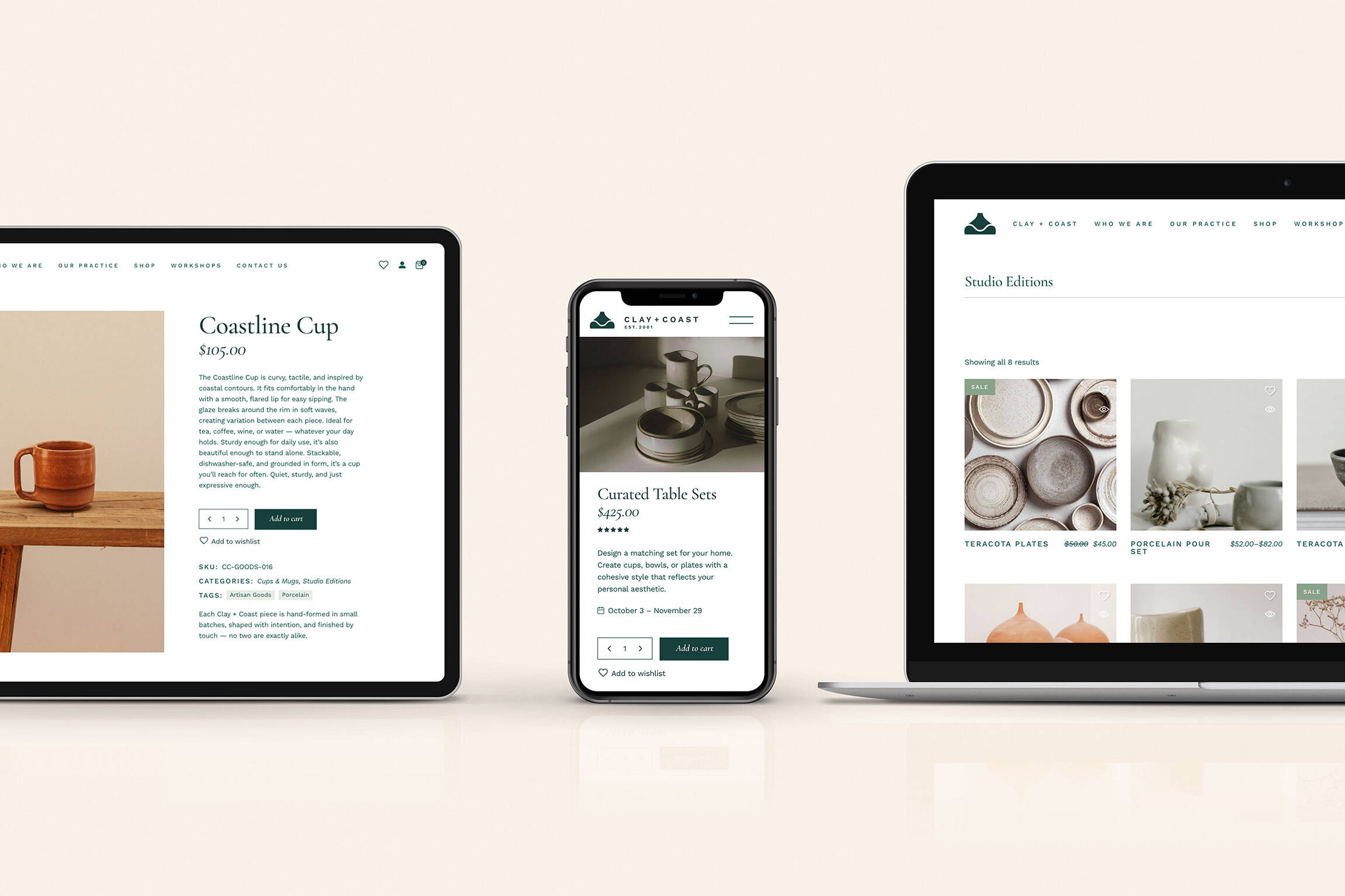
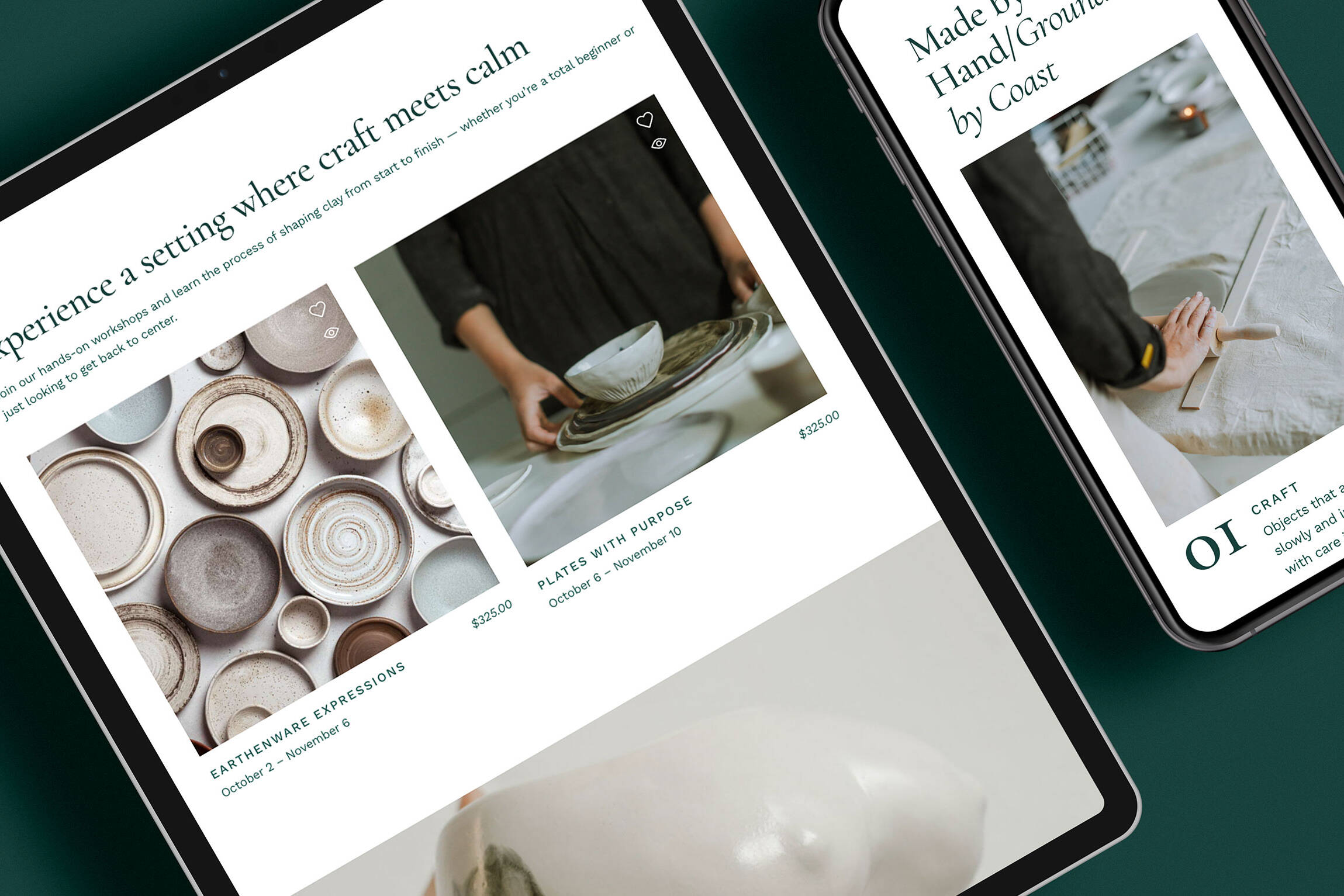
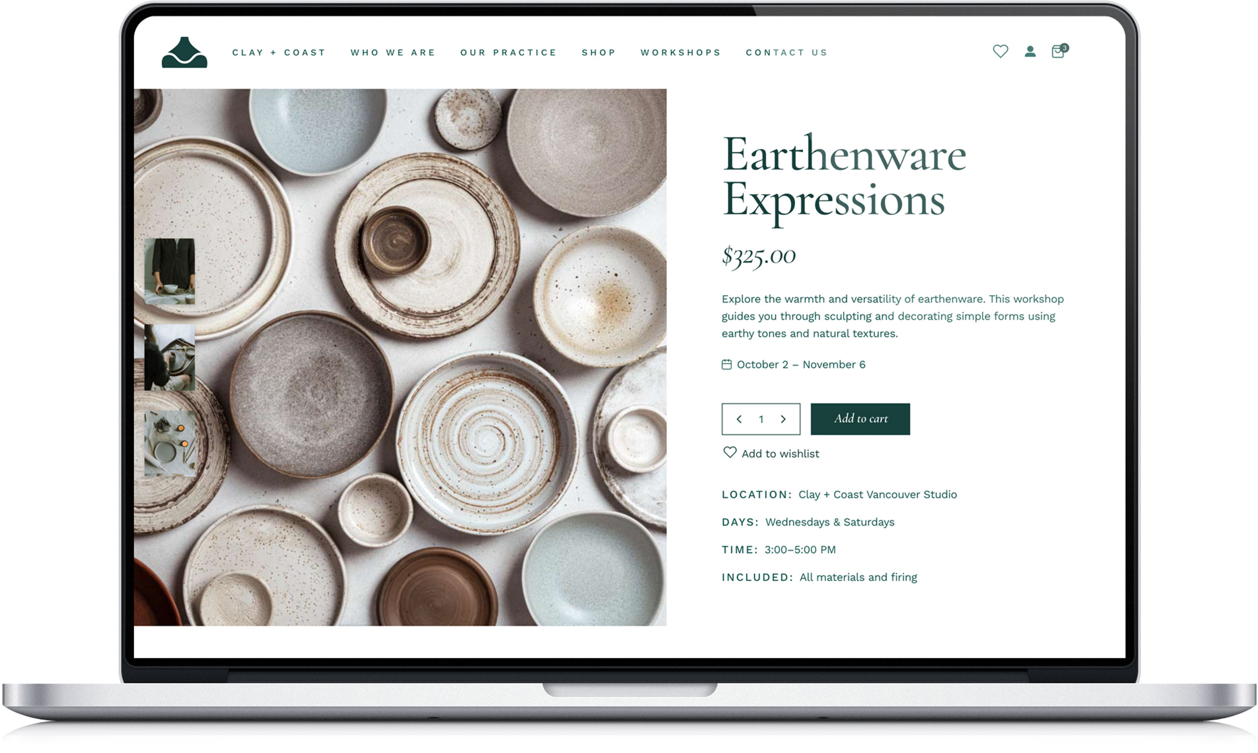
Rather than approaching the project as a traditional e-commerce build, we designed the website as a calm and carefully paced experience that mirrors the atmosphere of the studio itself. Large amounts of whitespace, restrained typography, thoughtful imagery, and a simplified content structure were used throughout the site to create a sense of focus and clarity. Visitors are given room to explore, learn about the studio, and discover workshops without feeling rushed or overwhelmed.
The workshop experience became the central focus of the user journey. Navigation, page hierarchy, and content strategy were all built around helping visitors understand what Clay + Coast offers and making it easy to find the right workshop for their skill level. Beginner programs and more advanced multi-week courses were presented in a way that felt approachable and inviting, helping reinforce the idea that creativity is for everyone, regardless of experience.
The visual direction was equally intentional. Inspired by coastal landscapes, handmade materials, and editorial design, the website uses soft tones, natural imagery, generous spacing, and carefully crafted copy to create an experience that feels warm, grounded, and timeless. The shop remains fully integrated, but intentionally understated, allowing the workshops and studio philosophy to remain at the forefront of the brand.
The Outcome
The finished website successfully captures the spirit of Clay + Coast while providing a clear foundation for future growth. More importantly, it helps communicate what makes the studio unique. Rather than focusing solely on pottery as a product, the website positions Clay + Coast as a place for learning, creativity, and meaningful connection.
By placing workshops at the center of the experience and removing unnecessary distractions, the site creates a clearer path for visitors to engage with the studio while reinforcing the brand’s core values. The result is a digital experience that feels calm, intentional, and authentic — one that reflects the same care, patience, and craftsmanship found in the work itself.
Like what you see?
Let's schedule a chat.
Tell us a little about your project and we’ll see how we can help. We’ll review your request and get back to you within 1–2 business days. Prefer not to use a form? You can call or email us instead.
Phone: 1 855 598 2290Email: [email protected]